Saturday, August 29, 2020

Lettering

I've written about doing the calligraphy drills with the Happy Ever Crafter in January. Since then I have continued to follow her and some other lettering accounts and try out some projects of my own.

Here was a card I sent to a friend.
We were having a conversation about looking back and seeing all the things you could have done better. But isn't that just a sign that you are not that person anymore? The card itself was blank except for the bird printed on it. I bought a set with the bird in four or five colours and really like them.

I came across this verse in some reading and it struck me as a good verse to put on a card to hang.
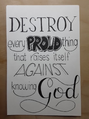
Obviously, I'm still learning, but I did like the was the word "God" came out!

I also have been doing envelopes. I started with simple calligraphy on the name and a fun font for the address. I hadn't learned any capital letters, so the first way I stepped up my game was to fancify the first letters of the names.

Then I tried bounce lettering:
I can't say I'm a fan (or very good at it!)

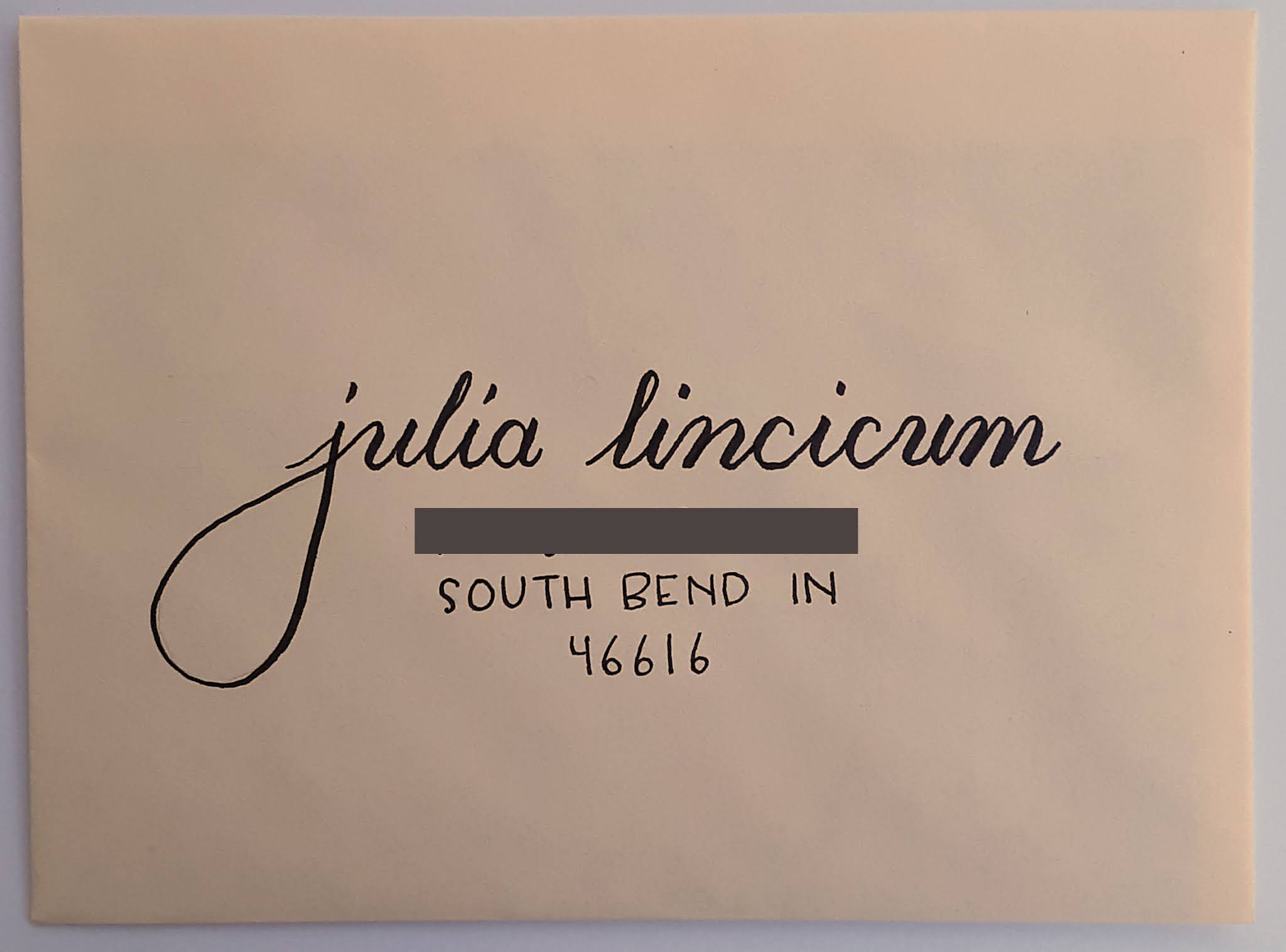
Then I started trying to add some flourishes.
And look! Capital letters!!
I downloaded the free "majuscule" sample sheet from the Happy Ever Crafter and tried some capital letters following her examples.

Then add some more flourishes:
A bit much maybe?

I liked the following composition better. I liked how the flourishes joined different letters.
I mean, the "y" into the "x" into the "t" -- brilliant, right?

I continue to do the banner style. I like this too.
I started to add a "please deliver to" line for fun.

But then sometimes I ran out of room!
So I had to put the zipcode on the bottom end.

Following more examples on Instagram, I created this composition:
This design inspired by the Happy Ever Crafter's
holiday wreath examples on her Dec 9, 2019 post.
and then this one:
I had a lot of fun doing those. I do the whole thing in pencil first so there's no commitment! Then it's just a matter of drawing on the lines.

And sometimes something like this happens:
to keep me humble!! :)

I also played with some floral letter forms:
The flower itself was drawn after the example in a tutorial
by...you guessed it...the Happy Ever Crafter.
For the first one, I did it completely in pencil and then traced it. After that I was a braver and did it straight in marker. At first the flowers and the leaves were done with the same size marker, and later I did the flowers in the small marker and the leaves with the extra-small marker. For all of these, I printed the letter on paper, put it under the page I was working on, and then used the shape that showed through to tell me where I could and couldn't draw. This gets pretty zen.

Also, I put my initials on all of them. Can you find them?!

And finally, I recently sent birthday cards to triplets, and of course I couldn't make all their envelopes the same!

A slanted banner:
I ran out of room on the top for the "please" and was feeling bad. Then I realized I could put it on the bottom. Problem solved!

Some calligraphy and a larger font for the address:
I have to say capital "F"s and "T"s have been my nemesis. I have never liked them and certainly never liked how they turned out when I tried them. I studied some of the samples in the free sample book linked above and was able to pull these off. Not bad.

And finally:
I saw another example on Instagram with the address fit into the inside circle of the wreath and had to try it. I was slightly worried that this would come back for extra postage because it needed to be hand cancelled or that it would be delayed, but it went through just fine. Yay, USPS!

Tuesday, August 18, 2020

Scrappy Trip Around the World Begins

Remember the Quilty Adoption Event in April? I wrote about the first item I adopted -- a quilt top that I disassembled and sewed the blocks in a new layout -- and in that post, I mention a second item, but haven't written about it since.

If you follow me on Ingstagram, you will recognize these strips that I adopted:
It was a big box of single 2" strips, loosely sorted from light to dark and a bunch of strip sets already sewn together. There's a project the sewn sets were intended for and I'm still deciding if I will go ahead and make it, or use these strips for something else.

Meanwhile, I took the single strips and sorted them in groups from light to dark.
I then sorted those groupings into five gradations I called light, light2, medium, medium2, and dark because I needed five different groups to make a trip-around-the-world (TATW) block.
I have become enamored with the scrappy TATW blocks popularized by Bonnie Hunter. (Link to her tutorial.) These blocks I'm making have a similar effect but with a little more order to them because of how the lights and darks are placed.

For the first set of blocks (above) I created sets by pulling similar colours from each of the five categories. That was enough to show me that I was going to have to do a little more pre-sorting if the sewing was going to be any fun.

So I took the five gradations, and sorted each one into different colour families.
Some of the strips are in more than one colour group, and sometimes it's a stretch when a fabric is multicoloured but I had to put it somewhere. Above, clockwise from top left, is, purple, blue, red, yellow, and green.

This was the first layout I tried on the design wall, just to have a proof of concept.
The project sat for a while then and while it was sitting, I thought I would try to make strip sets ahead of time so the sewing would be even easier. It was just too hard to see if the fabrics contrasted enough when I grabbed strips while I was sewing.

So, recently, I sat down and pulled out one colour group at a time and made some sets. For the first colour group, I did it just by eye, but then realized I should be putting my camera to use.

In this photo, the strips in colour are a bit of a jumbled mess, but when I convert them to black and white, I think the contrast is just what I need. (In this case, M-M2-D-M2-M, as in medium, medium2, dark, medium2, medium.)
In this next set, I think it looks good in colour, but the black and white shows that the first two fabrics are pretty close in value. (I think I used this set anyway because my choices are limited.) This strip set is L-L2-M-M2-D.
In the next photo, I'm going for another L-L2-M-M2-D, and I think the fourth fabric looks darker than the third in colour. But in black and white, I think they are too similar to use.
The next picture is an example of M2-D-M2-M-L.
In the fourth position, there are actually two fabrics (buttons and a floral). I was trying to see which was better. Even though I think they are the same value, I think I went with the buttons because there was a little better contrast. The floral seemed to mush in with the other florals. And I think it's clear that even though the two reds in the first and third position look different in colour, in black and white, they are the same value.

The fabric strips are all different lengths and it didn't take long to realize that I needed to pay attention to how many inches of each combination I was going to get. For each inch of one strip set, I needed 2 inches of the other two strip sets for each block. I didn't worry about getting it exact but I couldn't be way off either. I sorted a lot of fabric and ended up with sets ready to sew.
Another day I tackled sewing some of the strip sets (below). I had tried to match strips of similar length, and just cut them to match the shortest length for easy sewing.
Once they were sewn I figured out how to iron the seams the right way, and cut each set into 2" pieces.
I stacked up the pieces to make blocks (seen at the top of the picture above), and then sewed those strips together.

And here we have my first set of blocks sewn from this process:
I have since sewn sets from two other colour families, and here they are on the design wall:
I don't know if this will be the final layout, but it's a fun way to put them on the wall for now.

______________________
Linking up with Oh Scrap! hosted at Quilting is more fun than Housework.

Sunday, August 16, 2020

Desk Warming Gift

I finished a little something.

We are in the process of moving our "office" desks from the dining room up to our bedroom, now that the bedroom is largely finished.

Troy recently finished his desk top (which he mounts on a pair of file cabinets). When he first sat down at it, he commented that he is going to need a mug rug to protect the desk surface.

Well, that is something I can take care of making! A few days later, I was in the mood for a small project that I could finish in short order and got to it.

I knew I had some leftover half-square triangles (HSTs) from my Merrily Christmas quilt top:
I had a bag of brown/tan HSTs and a bag with the green and red ones. I found the brown ones first, so those are what I used. And happily, that meant they were much less Christmas themed as well!

I pulled out all the HSTs from the bag and played with them until I had an arrangement I liked. Then sewed it together like a simple 16-patch.
I layered it with a layer of cotton batting on top (to absorb any moisture) and then a layer of wool batting on the bottom (to keep the moisture from soaking through). That's the theory anyway; I'll let you know if it works!

I backed it with some of my never ending supply of black leftovers and quilted it in echoed mitered corners.
My machine wasn't too happy with the thickness (or at least, that's what I assume it was). There were some flubbed stitches that you can see on the back.

I used the edge of the pressure foot to guide the distance between the lines and that happened to also cause the lines to fall along the seam lines. I had considered ahead of time whether to do the calculations to make this happen but decided to leave it to fate. And it worked out that way anyway. I wouldn't be surprised if the makers of pressure feet design them that way. (For example, making the edge of the foot 1/4" from the needle position would mean that it would line up with almost all blocks as they are general sized every 1/2".)

That is as far as I got the first afternoon. The next day I took the time to make binding from a piece of grey fabric I bought for my Lucy Boston project but didn't use. There wasn't enough for a double binding, so I just used a single thickness. It's not like this edge is going to get a lot of wear or have to stand up to much use.
I stitched it to the back so that the part that folded over to the front would be longer. Then when I stitched it by machine on the front, the stitching ran beside, but not over, the binding in the back.
I don't usually enjoy stitching binding by machine and am not usually happy with the result. (Those two things just might be related!) But for this one, I hand basted all the way around the front, right next to the fold. Then I could stitch just inside that stitching and nothing had a chance to shift or move. This isn't practical for a large quilt, but it was worth it to me for this project.

So now Troy has a mug rug for his desk, and since he's getting close to finishing my desktop, I have to start thinking about mine! I think I'll go look for those green and red leftover HSTs, Christmas themed or not...

May I suggest?

I Say! or at least I did once...