Showing posts with label colour blending. Show all posts

Monday, February 22, 2021

Scrappy Trip Around the World Blocks

Remember this project?
This was how many blocks I had done in August.

For the next set, I matched up more strips sets sorted by colour.
My sister had given me this color tool and I finally thought to use the red and green filters to check values so I didn't have to take a hundred pictures and convert them to black and white.
That saved a lot of time!

By the end of December, I had this many blocks:
At this point I was running out of darker fabrics because the blocks use a lot more of it than the lighter fabric. So I thought, maybe I should make some light blocks, like this:
I put it on the wall to see how it would look:
I also wondered about making every other block a light one.
We'll see.

In mid-January, I worked on the heart. I didn't like the dark lines going through the middle.
I made some replacement blocks:
but I still didn't like how it looked. The diagonal lines didn't match up; the red is too thick on those blocks. So I took apart the blocks and reassembled them:
That's better!

I'm not promising this quilt will even have a heart on it, but if it does it will be one I like! ;)

And now the blocks are packed away in a box as I needed to put my Lucy Boston up on the wall. The ideas can marinate while I work on other projects.

Tuesday, August 18, 2020

Scrappy Trip Around the World Begins

Remember the Quilty Adoption Event in April? I wrote about the first item I adopted -- a quilt top that I disassembled and sewed the blocks in a new layout -- and in that post, I mention a second item, but haven't written about it since.

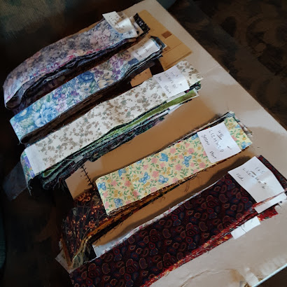
If you follow me on Ingstagram, you will recognize these strips that I adopted:
It was a big box of single 2" strips, loosely sorted from light to dark and a bunch of strip sets already sewn together. There's a project the sewn sets were intended for and I'm still deciding if I will go ahead and make it, or use these strips for something else.

Meanwhile, I took the single strips and sorted them in groups from light to dark.
I then sorted those groupings into five gradations I called light, light2, medium, medium2, and dark because I needed five different groups to make a trip-around-the-world (TATW) block.
I have become enamored with the scrappy TATW blocks popularized by Bonnie Hunter. (Link to her tutorial.) These blocks I'm making have a similar effect but with a little more order to them because of how the lights and darks are placed.

For the first set of blocks (above) I created sets by pulling similar colours from each of the five categories. That was enough to show me that I was going to have to do a little more pre-sorting if the sewing was going to be any fun.

So I took the five gradations, and sorted each one into different colour families.
Some of the strips are in more than one colour group, and sometimes it's a stretch when a fabric is multicoloured but I had to put it somewhere. Above, clockwise from top left, is, purple, blue, red, yellow, and green.

This was the first layout I tried on the design wall, just to have a proof of concept.
The project sat for a while then and while it was sitting, I thought I would try to make strip sets ahead of time so the sewing would be even easier. It was just too hard to see if the fabrics contrasted enough when I grabbed strips while I was sewing.

So, recently, I sat down and pulled out one colour group at a time and made some sets. For the first colour group, I did it just by eye, but then realized I should be putting my camera to use.

In this photo, the strips in colour are a bit of a jumbled mess, but when I convert them to black and white, I think the contrast is just what I need. (In this case, M-M2-D-M2-M, as in medium, medium2, dark, medium2, medium.)
In this next set, I think it looks good in colour, but the black and white shows that the first two fabrics are pretty close in value. (I think I used this set anyway because my choices are limited.) This strip set is L-L2-M-M2-D.
In the next photo, I'm going for another L-L2-M-M2-D, and I think the fourth fabric looks darker than the third in colour. But in black and white, I think they are too similar to use.
The next picture is an example of M2-D-M2-M-L.
In the fourth position, there are actually two fabrics (buttons and a floral). I was trying to see which was better. Even though I think they are the same value, I think I went with the buttons because there was a little better contrast. The floral seemed to mush in with the other florals. And I think it's clear that even though the two reds in the first and third position look different in colour, in black and white, they are the same value.

The fabric strips are all different lengths and it didn't take long to realize that I needed to pay attention to how many inches of each combination I was going to get. For each inch of one strip set, I needed 2 inches of the other two strip sets for each block. I didn't worry about getting it exact but I couldn't be way off either. I sorted a lot of fabric and ended up with sets ready to sew.
Another day I tackled sewing some of the strip sets (below). I had tried to match strips of similar length, and just cut them to match the shortest length for easy sewing.
Once they were sewn I figured out how to iron the seams the right way, and cut each set into 2" pieces.
I stacked up the pieces to make blocks (seen at the top of the picture above), and then sewed those strips together.

And here we have my first set of blocks sewn from this process:
I have since sewn sets from two other colour families, and here they are on the design wall:
I don't know if this will be the final layout, but it's a fun way to put them on the wall for now.

______________________
Linking up with Oh Scrap! hosted at Quilting is more fun than Housework.

Thursday, July 11, 2019

Obsessions

If I knew how to add audio to my posts, you would have that Animotion song in your head for the rest of the day. Oops I looked up a link and now it is in my head. Click this link if you're curious, but at your own peril.

I currently have two crafty obsessions. I recently wrote about one--the bright stars on black quilt. I have finished quilting all 18 of the centre stars. While working on them, it became obvious that I would have to stitch around the border stars as well.

Outlining the outside seemed obvious, but I wasn't sure what to do in the centre square. I drew an eight-pointed star in the same shape as the centre stars, but it was too complicated. Then I tried a square
and an eight-pointed star which matches the border stars instead of the centre ones.
I went ahead and stitched them. I was impatient to stitch and wanted to see what it would really look like--not just a drawing. I put both examples on Insta for an informal poll and the general consensus agreed with my eventual conclusion--the simple square was best.

But no, I didn't bother to take out the stitched star. I left it. Since then I have stitched the stars along two and half sides and have added a few different centres here and there. Mostly different star shapes.

It's been fun choosing floss to match the stars. I've taken to choosing for a whole side at once while the floss is out. Then I can put it all away for a while.
This project has taken over my couch, coffee table and two side tables (one holds supplies and the other supports the quilt in front of me). These little stars are so addictive. They don't take long and I am compelled to start the next one once one is finished.

Before this quilt, I was obsessed with a knitting project. I had it with me yesterday for a car ride and it's just as compelling despite my quilting break. I'm working on the Boxy Tee from this year's Spring/Summer Vogue Knitting. You can see a picture here with my first two swatches:
It's made with two strands held together. You start with two of the same colour and then switch out one strand for another colour. Then after a few rows, you work with two strands of the second colour. Et cetera. This gives a quick and dirty blend from one colour to the next. If you chose two similar colours (like the pink and peach in the magazine picture above) the blend is more subtle.

Most of why I love this design is the colours they used but I wasn't going to buy the yarn for this project. I have lots of lace weight yarn ravelled from sweaters and left over from other projects and wanted to see what I could do with my existing stash. Above you can see my first two swatches. The yarns were too thick in the top one so I rejected those. A few in the second one were acceptable but some didn't work because of their fibre content.

I narrowed to the yarns that would work and did a swatch to find the right needle size.
I was still on the fence about whether the project was worth doing--would I wear it once it was done? I didn't really think so. But I continued because I still wanted to pursue the experiment. I calculated yardage and assigned colours to the pattern's A, B, C, and D designations. This was my first start:
I didn't like it. The colours weren't really blending. It would look better from a distance (how most people would see a shirt I'm wearing, after all) but I didn't like it so I took it out.

New plan. I narrowed the colours further and put them in an order I thought would aid the blending:
and started again.
I didn't like the way the pattern blended the colours, so I tried a different blend pattern from the pink to the blue, and a third blend from light blue to dark blue. I didn't like the blue blend, so I took it out and did it again like the pink/blue blend.
I wanted a variety in the blends so I wrote up ways to do it over 30 rows, 26 rows and 19 rows. I then wrote up a whole new stripe/blend pattern for each piece, how many rows to do of each colour and which blend pattern to use from each colour to the next.
This is the first piece, the right side of the back. I still wasn't sure if this would be a wearable piece, but I knew there was no stopping now.

In the second piece (left back), I switched the starting point in the colour sequence and added a pop of lime:
When they're sewn together, it will look something like this:
When I took these pictures, I was this far on the third piece (right front):
but by this writing, I'm almost done this piece too. For this one, I switched up the colour sequence (a little).

By now I know I'm going to finish the piece and even if I don't like how it looks on me, I'll wear it. The cashmere, wool, and silk of these yarns are making a wonderful light fluffy magical fabric. It will be a dream to wear.

One thing these projects have in common is changing colours over the piece. This is a big reason why it's so compelling. Everyone knows a striped garment is faster to knit than a solid one. You push yourself to finish and/or start the next stripe and before you know it, you've knit a whole lot.

May I suggest?

I Say! or at least I did once...